
The most drastic of corporate solutions, the logo redesign!
![]()
Kirk: “Scottie I need more power!”
Mr. Scott: “I’ve given you everything she’s got Cap’n she just can’t give any more”
Spock: “Captain, might I suggest an alternate plan? Given the situa… “
Kirk: “Agreed, a complete redesign of Star Fleets logo, that will fix things!”
Why is it that when a company or product is in trouble a complete logo redesign is done?
Logos get redesigned all the time and not always for the best of reasons, some of those reasons include brash and impulsive justifications. Sometimes it’s because the company’s sales became stagnant, or upper management got bored. Or a newly minted MBA convinces the C-suite that the mark needs a complete facelift. I think we can all agree those aren’t the best reasons to undertake such a drastic change to a brand, but it happens and usually nothing good results.
That’s not to say that changing a logo is never a good idea or smart, there are a few reasons to change a companies mark. What is important however is keeping true to the marks original nuances and intentions. That’s because any logo that has been used for 5-10 years has valuable equity built up in it, even f it’s ugly or poorly designed. The audience for any given logo or mark begins to remember it, recognize it, and use its familiarity to know they’re dealing with the right company.
Here are some examples of logo re-do’s and what was good and not so good about them:
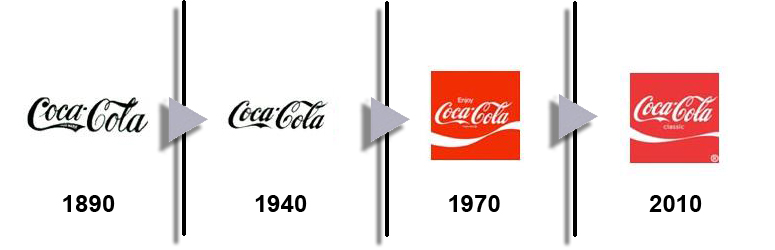
Consistency – Good
Take a look at Coca Cola; they are the masters of keeping the aspects of their mark true to the original over the past 125 years.
Inconsistency – Not so good
Five years ago Tropicana decided it was time to re-do their iconic brand and look, it totally bombed and confused customers and made it hard to find on the shelf.

Signaling a Change – Good
When Marisa Mayer took over as CEO of Yahoo it was time to let the world know that something had changed and things would be different.

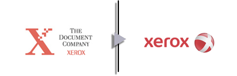
Change for Change Sake – Not so good
Xerox represents so much of the new media world we live in yet can claim ownership for so little of it, it’s has changed its look so many times it’s lost its clarity.
How does this happen, what does it mean?
There are many reasons a logo redesign happens, the majority of the time though the desire to make the change emanates from the C-suite and typically it’s done in secret. The results of the change are the harbinger of tough times to come in the company’s future. Why? Because the two sure signs in corporate America that things aren’t going well for a company or that it’s lost its way are:
- A meeting is called for input to rewrite (or write) the mission statement
- An email arrives stating that after an “exhaustive” effort here’s our new logo
Keeping a mark current, tightening up its look, or reengineering it to accommodate new medias is always a smart thing to do when it comes to a company’s mark. Trying to change the culture, reinvigorate it, or cover up for past miss-deeds should never be a reason to re-do the brand or company logo. The company’s mark is the culmination of a brands appeal not the realization of it. Keeping the mark clean and true to its roots is a sign of strength and means all is well and that the leadership has its priorities straight.
One more thing to keep in mind, even an ugly logo can possess great brand value.