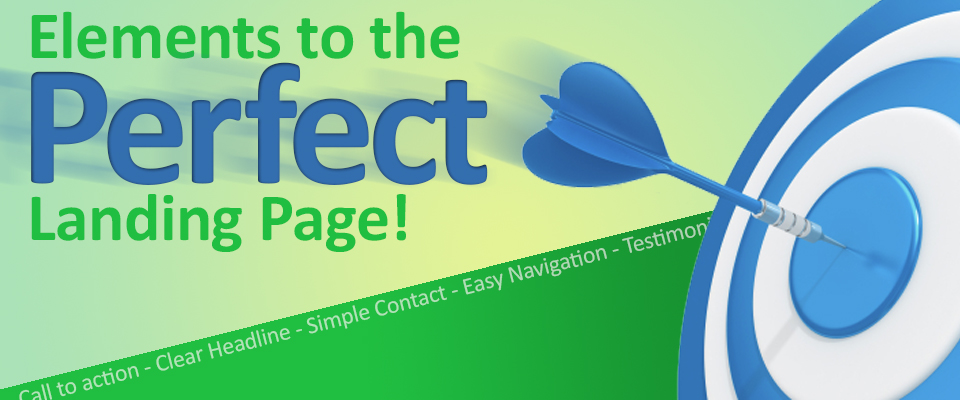
If You Build A Landing Page, They Will Come!
But they might not stay. You spent time coming up with the perfect ad or content that drives your audience to your site for more. Why let that effort fall flat on a weak landing page?
We all know that sending traffic to a regular page is like throwing a party for no reason. People come, not a lot, and those that do won’t really know why they’re there. They’ll soon leave confused and some might even be annoyed at wasting their time and they’ll blame you.
Fear not, there are some simple devices that you can use on your landing page to get the results you want. If implemented correctly on the page you’ll give your marketing efforts purpose, focus, and closure, in short your sales pitch will sing.
Any page on your site can be a landing page, but to get the most from your marketing efforts you need to take your audience to a landing page specifically set-up for that marketing campaign or effort. Assuming you’ve set up your URLs to accommodate those aforementioned marketing efforts? your landing pages will become true destinations for those visitors not just another page on your site. If you agree with that then using all or some of the following elements will help to focus the viewer to the end goal.
That goal being conversion, adoption, or purchase. The following elements, placed correctly on your landing page, will give your audience a chance to think and provides them with crucial info in a calm focused area away from the other ads and content that can distract and confuse. The viewer can only get to this page by clicking on or knowing the URL you provide, they’re not part of your main site so they won’t be found in a casual search. That’s how you’ll know they are interested, by clicking on your ad, story, or link they have already declared their desire to hear your pitch, a good landing page will keep them interested and close the deal.
The 9 Elements of a strong landing page:
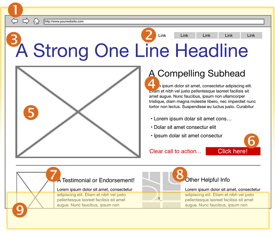
Important: the order these items appear is very specific and should be followed since they follow the way your viewers will scan across your page.
You can have your logo, your company colors, your fonts, and your style but limit them to the bare essentials. This is a framework for your message to adopt/buy your service or product. Your brand shouldn’t overwhelm your audience it should support it and clarify it. Limit the headers and footers to just what is needed for your audience to grasp who you are and satisfy your compliance needs.
A few points of note, if your page will be taking in info of a personal nature, having the “https://” at the beginning of your URL will provide some comfort to those who notice it. It’s also a good idea to keep your URL free from versioning code and in plain english, “12666ahj889” is difficult to remember and type, “best_product_1a” is easy.
This is not the time to provide your audience with an escape route, now is the time to provide them with the ability to go to other pages that support the sale but it’s not a time to take them away from your efforts. You should have your company logo, it can take them to your company home page but have it open a new window to show it in, but do not put the full navigation that your main site has, in short you should not feature the full nav here. If you have a particularly long page then providing a list of anchor tags with a “back to top” link is a good way to go. If there are a series of pages that support this one then list them, but those pages should follow your landing pages look and feel as well.
A clear continuation from the ad or story that brought them here is what’s in order, pose a question in the ad that brought them here? The landing page headline should provide the answer and in this day and age of 140 characters, less is definitely more. You can adjust the point size to accommodate the line length and but you should attempt to keep it to one line, remember size denotes importance so try to keep the size of your headline as large as possible so you can differentiate it.
Now is no the time to become verbose, now is the time to be clear and concise, from bulleted lists to short choppy copy almost staccato in it’s tempo. Why? No one is going to invest much time here, they’re looking for buzzwords that back-up their decision making process. Scanning the copy will be how most of your audience will pick-up your meaning, boldfacing some of the words and using lists and increased leading will have the best effect here.
Be consistent visually, if you used a photo or graphic in your ad or content to get your viewer here use it again. If you came in close on the photo that brought them here, pull out and show the whole photo on your landing page. If there was a series of photos available and used in the article or ad that started this off,then use the next in the series. This is a great way to continue the story telling without having to use up valuable space, as the saying goes; a good picture is worth 1,000 words.
Both visually and copy wise will give your audience the ability to know what you want them to do. Take them to a form, let them download a white paper, let them call an operator these are all calls to action and give you the ability to build your mailing list and contact your audience later on. All of it stems from simply asking your audience to do something.
Ok, you got my attention, you got me to your page and I am liking what I see, what will help seal the deal now is an outside source telling me they’re happy with this product or service. There is nothing new here, just that now it’s source can be from social media or it can be a video taken at a trade event or on the street, or the tried and true written quote. They all do the same thing, help to solidify your feelings about adopting this service or product on the page, but now you can easily ad sound, motion, or full color.
Maps, abbreviated FAQs, contact lists, warranties or time lines… these items should be part of the page, they help with the immediate post decision making process but they’re not critical to making a decision to adopt. Placing these items low on the page is a good place for them or they can be called out in a side bar or pull quote.
Also known as the bottom of the page or browser or screen, they all mean the same thing, if you need to have a longer page then do so. The concept that a viewer won’t scroll is nonsense, if you tell a compelling story or have a logical and obvious need to scroll down the page your audience will do so. However! You need to keep the critical items (the 7 shown here) front and center and allow other items to occur further down the page. Once you get to number 8, you can begin to allow them to scroll down the page to see them. Remember though you win points for being concise so be mindful of putting information within your audiences grasp.
Be concise, be consistent in you appearance and your copy, provide good direction, and remember that if you brought your audience to this point they want what you’re selling. Some of your audience might not be at the “buy” moment just yet and they may take more persuasion, so being helpful and persuasive makes all the difference in the world. Your landing page should create a safe haven for those still thinking about it and help them to make up their minds and ultimately convert. Remember they clicked on your ad, story, or link and now they want more, don’t overwhelm them or force them to take a sip from a fire hose, give them a glass and a moment of repose.
Less is more when it comes to landing pages, your audience has bought in to your pitch now they just need a quiet moment to make sure it’s the fit is right. It’s a long journey so reward your audience with a calm clear and concise page to work from, they’ll reward you with a buy!