
Pie, Bar, Line… Which Chart Should You Use?!
 Charts and graphs, laid-out horizontally or vertical, small or large, they’ve emanated from spreadsheet data or off the back of an envelope and they all have one thing in common. There is a correct chart format to be used for the information being portrayed. If the wrong format is used? At the very least the information shown is confusing, and at its worst, it can ruin a future.
I am talking about the simple chart and graph.
I’ve been working as a graphic artist now for over 25 years; in that time I’ve worked on all manner of projects both print and digital. I’ve created whole campaigns and pieces with huge budgets, I’ve created parts and pieces of large projects and small one off graphics for others. The range of projects I’ve worked on has been immense, but, the one item that appears more often than anything else in all of them is the humble graph or chart.
As a designer you often are the last step in the chain, you get the materials to create the piece with but you are where the rubber meets the road. Be it a web page, a brochure, a slick sheet, or a presentation it usually comes down to the designer and the copywriter staying late and getting the job done. I’ve often been on the receiving end of the “poke-and-run” from a manager or VP who breezes in drops off the sketch or info and then rolls out saying, “Do your magic Steve”. Most of the time it’s for a last minute chart, but something doesn’t quite make sense, somethings don’t line up, and that’s because the wrong chart is being used to represent the data.
It’s in this quick hand off that much can be lost or muddled, not the least of which is a critical chart or graph. I’ve learned over time when and where to use certain charts and that’s saved me a lot of time and effort. But it occurred to me that no everyone may know this, or over time they’ve forgotten some of it, so I decided I’d cover it here. It bears repeating for some project managers and for some upper managers that certain graphs can only be used in certain situations.
Here’s a short list of the what’s, when’s, and why’s of some of the more popular charts and graphs so you can use them appropriately:
Line graphs are used to track changes over short and long periods of time. When smaller changes exist, line graphs are better to use than bar graphs. Line graphs can also be used to compare changes over the same period of time for more than one group. The more groups the harder to view in smaller chart sizes. A Line graph:
Pie charts are best to use when you are trying to compare parts of a whole. They do not show changes over time. They are also for one data set, if more data sets need to be compared then more pie charts can be displayed side by side. Large data sets should be plotted, small ones get lost.
 A Pie Chart:
Bar graphs are used to compare things between different groups or to track changes over time. However, when trying to measure change over time, bar graphs are best when the changes are larger. Line graphs and bar charts can be displayed on their side of the labels are too long.
 A Bar Graph:
Area graphs are very similar to line graphs. They can be used to track changes over time for one or more groups. Area graphs are good to use when you are tracking the changes in two or more related groups that make up one whole category (for example public and private groups).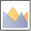 An Area Graph:
X-Y plots are used to determine relationships between two different things. The x-axis is used to measure one variable and the y-axis is used to measure the other. If both variables increase the same, it’s a positive relationship. If a variable decreases and the other increases, they have a negative relationship.
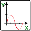 An X-Y Plot:
Is a tool for analyzing relationships between many data sets and two variables. One variable is plotted on the horizontal axis and the other is plotted on the vertical axis. The pattern of their intersecting points can graphically show relationship patterns between the data sets and the two variables.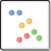 A scatter diagram:
A Gantt chart Illustrate the start and finish dates of the terminal elements and summary elements of a project or it’s overall schedule as it relates to other project dependencies. Typically it is used in conjunction with a time or date schedule so that the viewer can easily see where overlapping issues will take place.
 Gantt chart:
A candlestick chart is a style of financial chart used to describe price movements of a security, derivative, or currency. Each “candlestick” typically shows one day; so for example a one-month chart may show the 20 trading days as 20 “candlesticks”. Made up of two parts the bar will show one variable and the line will show another.
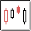 A candlestick chart:
Now most of the time it becomes evident very quickly that the chart in question is wrong for the data being displayed. The round peg in the square hole syndrome. Some of these charts and graphs have variants and you can use them to solve an issue with little to no fuss, think stacked bar chart or horizontally laid out to vertical. But that’s not always the case and many edit cycles can go by before it’s finally figured out that the wrong chart or graph is being used to display the information. So be open to exploring options and chart variants. One more point of note, be careful how you use 3-D since that introduces a third axis, quantity vs. time vs. distance, and even though it’s cool it should be reserved for when the data being displayed is very clear and the other axis doesn’t muddy the concept.
In the end, knowing which chart to use and when will help everyone make sure that whatever information is being displayed is being done so in an optimal way. I wish you all “Good Graphing”!